

Mad Music
Mad Music was one of my school projects for my master's degree. Spanning the length of a semester, the project's aim was to create an interactive system that aims to improve the already existing infrastructure to aid the music listening experience.
My Role
UX Designer
Duration
Jan 2021 - May 2021
Team
Solo Project
Tools
Figma, Adobe After Effects, Adobe Illustrator, Google Docs, Paper and Pencil
Overview
Music is an experience! It’s an integral part of everyone’s life. It brings a variety of emotions to the listeners, and everybody listens to music in a different way. For example, some people might use music to calm themselves from a stressful environment, whereas others might use music to hype themselves up for a workout session. Some people might use music when they are sad, whereas others might use music when they are happy. Some listen to it during a commute, and some listen to it while taking a bath. It’s so amazing to see how there is no one way to listen to music.
With this in mind, this project aimed to identify the pain points with the existing music listening experience and choose three main flaws to design an interactive system to solve them.
The Three Goals
These were the three goals of the project based on the results of my user study.
1. Ease of Discovering
Ease of finding new music that is similar to what the user likes.
2. Simplicity
A simple way to create and maintain a playlist through similar songs based on the playlist/ liked songs/ filters (artists, genres, vibe).
3. Sharing Music
To allow users to share music within the app and reduce the use of an external app.
User Research #1
Cognitive Walkthroughs
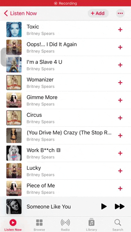
To begin with, I started performing cognitive walkthroughs with different existing music streaming platforms (Youtube music, Spotify, Apple Music, Pandora, etc.). The tasks were related to creating a new playlist and sharing the songs/ playlists with friends. In the image attached, you can see my experience interacting with Spotify. The steps with sharp edges are where I was frustrated during the process. Some of the pain points that were encountered during the cognitive walkthroughs are:
-
Too many steps to add one song to a playlist.
-
Inability to add multiple songs to a playlist at the same time.
-
The tedious process to share songs with friends.
-
The use of an external application to share songs with friends.

Cognitive walkthrough for adding songs to a new playlist on Spotify.

Cognitive walkthrough for sharing music with friends Youtube Music.
User Research #2
User Interviews
Following the cognitive walkthroughs, I adopted one of the primary methods for conducting the user research - Interviews! The motive behind choosing this method is to TALK TO THE ACTUAL USERS. I interviewed six people remotely to learn about their experiences with listening to music. Based on the results, I classified the users into three different user personas:
“Sometimes I will be listening to some nice songs while driving but I won’t be able to find what I listened to. I should be able to add songs to my playlist with a single click.”
- Sid
Passionate Music Lover

“I use the Global top 50 or US top 50 to find new music but I don’t like that because it’s not aligned with the music that I like.”
All-Time Music Listener
- Antony

“If I like a song it [Youtube Music] creates a playlist of all the songs that I like, but the problem is that it doesn’t classify based on different genres.”
- Anu
Casual Music Listener

The Problems
I found several pain points from the data collected through interviews and cognitive walkthroughs, but I chose the following three problems as these were the ones users were having the most trouble with.
1. Difficulty in Discovering
It is difficult to find new music, and sometimes people are stuck with the same set of songs to listen to until they find new ones or get bored of it.
2. Maintaining a Playlist
Creating and maintaining a playlist is cumbersome and often time-consuming.
3. Sharing Music
Sharing music with friends usually involves 7 to 8 steps and also involves the use of an external application.
Framing the User
Who is my user?
I created a user persona to represent my target user and visualize various aspects of their behaviors and motivations. I decided to go with the characteristics of a 'Passionate Music Lover' because of the significance the person shows towards music.

Framing the User
User Journey Map

Ideation
How might we?
After defining the target user, I created a list of "How Might We..." questions and started brainstorming ideas to solve them.
1. How might we simplify creating and maintaining a playlist?
-
Don't make the user think.
-
Suggest the user songs that they love to hear.
-
Help them find similar songs based on the songs already added in the playlist.
-
Use filters to help them search songs easily.
-
Use a swipe gesture to intelligently add songs to the appropriate playlist.
2. How might we help people discover new songs that they might like?
-
Personalized onboarding experience to gather information about the user
-
Friends activity page.
-
Collaborating with friends.
3. How might we help people share music with their friends/ family efficiently?
-
Allow them to share music within the app.
-
Use a swipe gesture to quickly share music with friends/ family.
-
Shared playlists.
Ideation
Competetive Analysis
In order to gather strategic insights on the features, functions, and feelings evoked by the design solutions of the competitors, I performed a detailed competitive analysis.
Experience #1: Maintaining Playlists
I was looking for features that'll do the tasks quickly. Below are the examples of some quick features I found from Gmail, Apple Music, Tinder and Whatsapp.
Adding music to library with a single click on Apple Music.
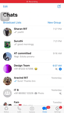
Swipe gestures to do different actions on WhatsApp.
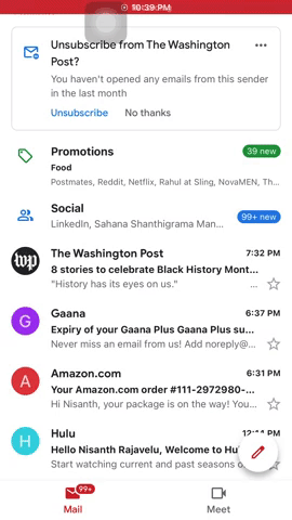
Customizable swipe gesture to do a set of actions on Gmail.
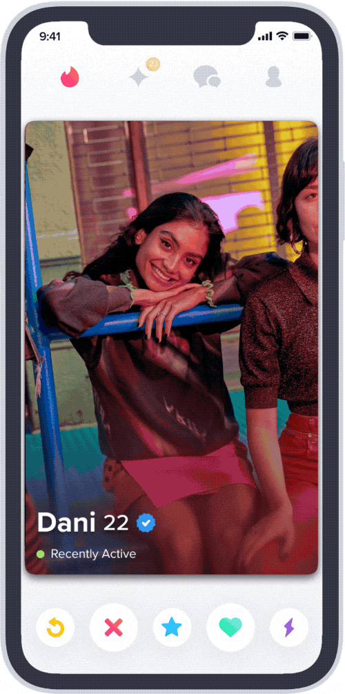
Swipe gestures on Tinder.
Experience #2: Discovering New Music
To design a personalized onboarding experience, I wanted to understand how current onboarding experience looked like in different products. I honestly didn't like the onboarding experience of Apple Music. The bubbles came from the sides and it was a slow and inefficient process. I liked how Spotify showed related artists of the artists that I just selected. It makes the onboarding process more personalizable to each user. Netflix onboarding experience was easy but it was not personalized so it asked me to select movies from a list of movies which I didn’t know of. But I liked how Hulu handled this problem by asking what genres of tv shows and movies that I liked initially and on the next screen it asked me to choose the tv shows and movies that I like. By this way, Hulu was able to provide a personalized onboarding experience.

Onboarding experience on Apple Music
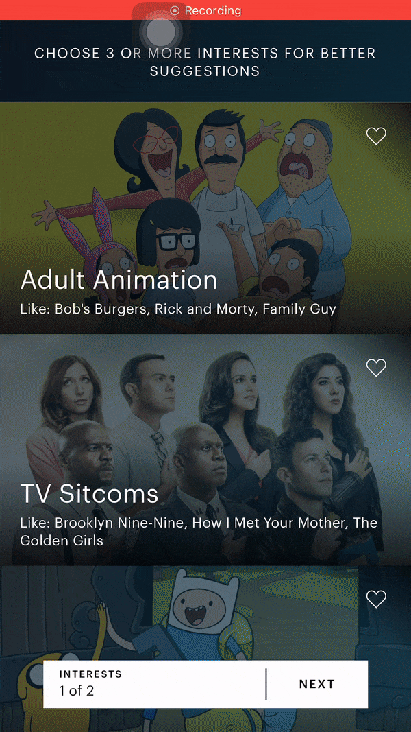
Onboarding experience on Hulu
Onboarding experience on Apple Music

Onboarding experience on Apple Music

Onboarding experience on Netflix
Experience #3: Sharing/ Collaborating with Friends
Below are the examples from Instacart, Goodreads, venmo, Instagram in collaborating with friends. I liked the way instacart allows collaborating with friends in adding items to the cart. It clearly indicates the people who are sharing the cart and the items added by each person in the shared cart. Instagram’s post sharing with friends is too easy and all it takes is two touches to share any post. I love that goodreads has a feed to see what your friends are reading. Venmo has a similar feed but it feels kind of creepy to be looking at other people’s money transactions. But this could be a great way to find what new music your friends are listening to.

Friends Feed on Splitwise
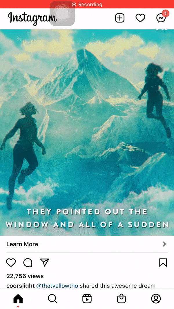
Sending messages on Instagram

Collaborating with friends on Instacart

Friends Feed on Goodreads
Iterations
Paper Prototyping
I sketched out possible solutions using pen and paper before committing to high fidelity designs. This allowed me to play around with different layouts rather than focusing on minor design details.


Iterations
Low-fidelity Wirerfames
I then opened Figma and started doing some low-fidelity prototypes.


Design Direction
I worked with the opposites of Goku and Vegeta for the design inspiration and mood boarding of this project. I went with Vegeta assuming that the dark and savage characteristics of Vegeta would provide a movie theatre experience for the users with the focus entirely on the content of the application.

Goku Mood board
Given how cheerful, friendly, confident and inviting Goku was always known for, I was looking for colors that gave me cheerful, inviting vibes in these images. With yellow as my primary accent and blue and pink as my secondary accents, I thought the users would feel inviting just like the character of Goku.

Goku Inspiration Board
Inspired from my mood board, I decided on yellow and blue as the main colors and pink as the accent. I felt that it would be pleasant and cheerful for the users to use the application for listening to music.

Vegeta Mood board
Given how bold, savage and moody Vegeta was known for, I was looking for images that displayed the characteristcs of Vegeta.

Vegeta Inspiration Board
Inspired from my mood board, I decided to choose black and orange as the main colors. I felt that the colors would provide a movie theatre experience with the focus on the content of the application.

Solutions
Experience #1: Discovering new music
User Flow

Onboarding Process
To help people discover new songs, the system has to understand their music preferences better to suggest music they like. One of the easiest and best ways to find what music people like is to ask them during the onboarding process. Hence, I designed a 3-step personalized onboarding process. As my primary user persona is a bilingual person, the first step of the onboarding process is to ask people what languages of music they listen to based on the user's region. Then, they'll be asked to choose the genres of music they listen to. Then, based on the answers from steps one and two, the system will provide a personalized list of artists for the people to select from. This step will also be dynamically personalized, i.e., as the user selects a particular artist, the system will add more artists who are similar to the selected artists.


Onboarding process Animation

Friends Feed
I designed a new solution to tackle the issue of discovering new music. 5 out of 6 participants said they find new music through their friends/ family. So I designed a feed where people can find what music their friends listen to. Considering privacy issues, this would be an optional feature, and people can choose if they want to share or not.

Solutions
Experience #2: Creating and Maintaining Playlists
User Flow
Adding songs to a newly created playlist
I designed a simplified process to add songs while creating a new playlist. The main idea was to not make the user think and make the system display what the user wants to see. Hence, when the user clicks on ‘add songs,’ the system provides a categorized list of songs based on different criteria like liked songs, similar songs (based on the songs already added to the playlist), Recently played songs, artists, genres, etc. From the list of songs suggested by the system, the users can add songs to the playlist with a single touch.


Adding songs to playlist animation

Smart Swipe to add songs to playlist
I added a smart swipe gesture to add songs to the playlist quickly. The smart swipe can predict the playlist you want to add songs to and intelligently adds songs to the appropriate playlist. This feature reduces the number of touches to add songs to a playlist to a single swipe.


Smart swipe animation


Solutions
Experience #3: Sharing music with friends
User Flow

Sharing Music with Friends
Sharing music with friends was one of the most inefficient processes I found through the research study. I had to go through many steps to send one song to my friend, and it involved using an external application like WhatsApp or Instagram. Hence, I introduced a swipe left feature to send songs to friends quickly. This allows the users to quickly send songs and chat with their friends within the application.


Sharing music animation

Watch UI Pairing
As a part of this assignment, I was also asked to design these experiences on one other device that was not a mobile phone. I chose to design an Apple Watch as it would be convenient to use, especially when you don’t have your mobile phone handy.
Watch UI
User Story
I created a user story for my watch user to better understand them and keep things user-focused, clear, and actionable.
"As someone who loves going to parties, I find it annoying that I have to use my phone to find a song that I listen to at a party when I’m busy partying. I’d love an application in my apple watch to find the music and add them to the playlist."
Watch UI
User Flow
The passionate music lover goes to a party. He listens to a nice song at the party and wants to know what that song is. He opens the app on his apple watch and taps on find music to search for that song. He adds the song to his favorite playlist and shares this song with his friends. He taps on the send icon and chooses the recipients to share the song with his friends.

Watch UI
Ideation - Sketches
Then, I started doing some rough sketches using pen and paper. The following sketches display the user flow of the watch pairing where the user discovers a song, adds it to the playlist, and sends it to a friend.

Watch UI
Solution #1: Discovering New Music
Say, for example, if the user is at a party and listens to a new song and wants to find what song it is. Then, the user can use the find music feature on their watch and just tap on ‘ Tap to Explore’ to find the music within seconds.


Discovering music - Animation

Watch UI
Solution #2: Maintaining Playlists
I redesigned the smart swipe feature for the watch interface. Here, if the user likes a song and wants to add it to a playlist, they can simply swipe up on the playing song and click on 'Add to playlist' icon to add the song to the appropriate playlist.


Maintaining playlist - Animation

Watch UI
Solution #3: Sharing Music
The quick music sharing feature would be much more efficient in the watch interface as it would be convenient for the user to interact with it especially when the user has limited access to the mobile phone.


Sharing music - Animation
